Monarch Population Status
Monday, April 20th, 2020 at 5:37 pm by Chip TaylorFiled under Monarch Population Status | Comments Off on Monarch Population Status
I have a confession to make. Well, actually, several. First, at this writing (12 April), I have no idea as to whether the monarch population is likely to increase or decrease this year. The signals are mixed. March temperatures in Texas are telling me one thing, optimal egg distribution is telling me another, and first sightings yet another. At this point, it’s likely that I won’t get a good sense of the direction the population will take until early June. I’ll get to why I’m confused below, but I have more confessions.
I’m obsessed. Yes, obsessed. It happens. This time I’m obsessed with the First Sighting Data posted to Journey North. This resource has the potential to tell us a great deal about how the population develops each year and I urge everyone interested in monarchs to report their observations to this long-standing and useful resource. There have to be patterns in a database this rich with information. Indeed. But what are they?
I’ve spent a lot of time searching for such patterns. Some are easy, and very clear, such as the distributions of sightings across latitudes going north. Each bump in the data represents cities and the surrounding suburbs, and there are gaps with few reports in areas with few towns and low-density human populations and gaps where milkweeds are scarce. There are also pathways along coasts and even a pathway, at least in most years, across northern Mississippi, Alabama, and Georgia. And there are other patterns related to terrain, prevailing northeasterly movement and the influence of weather patterns in given years. In addition, there are striking differences among years in the timing and number of monarchs that arrive in Texas in March along with the mismatch in the number of sightings relative to the size of the overwintering population the previous winter season. If you look closely, you can see gaps in the sightings that can be associated with weather events such as cold temperatures or periods of rainfall.
In addition, when trying to interpret the data, one has to be aware of its many limitations. It’s easy to show for example, that for specific regions, there are only a modest number of people willing to report first sightings. For a while, it appeared for Texas that that number was perhaps between 190–230 resulting in roughly 180–200 sightings for a number of years with the occasional low year. In this situation, only the low number of sightings is useful information since it would appear that the cohort of people willing to report sightings easily becomes saturated. In other words, due to saturation of the observers, large populations are not properly reflected in the data. A solution, of course, is to increase the number of people willing to send sightings data to JN, and that has been happening as well. That helps, but it presents another problem – how do you compare a recent year with a large number of sightings with previous years with lower numbers of sightings? For those comparisons, you can’t use the numbers and have to look for other metrics such as spatial distribution and temperature.
Below I have assembled screen shots of Journey North first sighting data as of the 11th of April each year. I haven’t given the specific years only identified them by letter, but they are easy to figure out if you are so inclined. My purpose is to challenge you to see some of the patterns I’ve mentioned and to ask you if you see anything in these records that explains the increases and decreases among these 7 years. I’ve included the average temperatures in Texas for March along with the overwintering numbers (hectares) for the previous and following winter seasons.
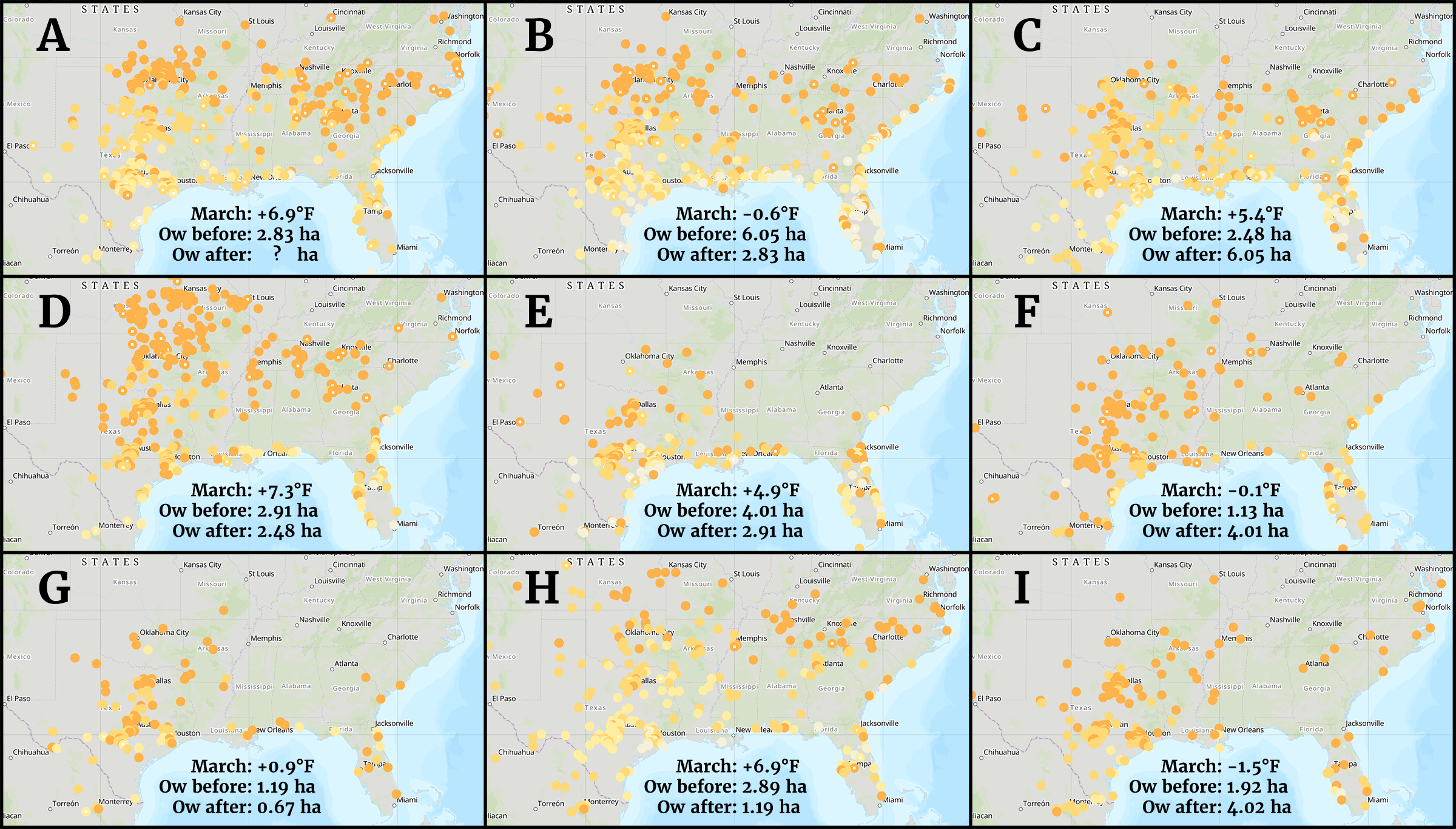
Figure 1. Journey North first sighting data as of the 11th of April.
Let’s start by comparing A and B. They look very similar, don’t they? C is sort of similar too, right? How about D? Wow! That pattern doesn’t look like A, B or C does it. What about H? Yes, let’s group D and H. What about F and I? again, the patterns are similar with lots of late first sightings (darker spots). That leaves E and G, which also have similar patterns but low numbers of first sightings in total and very few first sightings in the southeast.
Let’s start over with E and G. The populations in both years declined from the numbers recorded the previous winter. March temperatures were +4.9°F and 0.9°F respectively so the only common factors are the low numbers and the distributions. That’s not much to go on so there must be other factors that account for the declines in these two years, and there are, but that is another story.
F and I had similar patterns and appear to have been late recolonizations yet both increased substantially from one year to the next. In both years, the temperatures were close to the long term means for March, -0.1°F and -1.5°F respectively. That’s interesting.
D and H both have broad distributions with monarchs reaching into Nebraska and Iowa as well as Kansas and Missouri in large numbers in year D. The pattern is similar but not as dramatic for H. The mean temperatures were extremely high for both years, +7.3°F and +6.9°F above the long-term averages. However, the populations declined in both years. That’s also interesting and contrasts strongly with F and I when more restrictive distributions and temperatures at or just below the long term yielded significant increases in the population from one year to the next.
The dilemma is how to deal with A, B and C, especially A and B. The patterns for both years are similar. The numbers of first sightings up to the 15th of March were virtually identical (99 vs 104) with a pattern of the overall timing of arrivals and movement northward again highly similar. These factors seem to suggest that similar numbers of first-generation butterflies will be moving north to colonize the northern breeding areas north of 40°N in May and early June. However, the mean temperatures don’t fit the contrasting scenario presented by F and I vs D and H since the March mean temperatures were +6.9°F for A and -0.6°F for B.
We know what happened in B. The population declined when the F and I scenario would have predicted an increase or at least a decline that was not as large as observed. Indeed, all projections seemed to indicate a fairly robust population. As outlined in an earlier Blog article, two things probably account for the 2.83 hectares this past winter, the slowest moving migration seen to date and a drought in Texas and Northeast Mexico. There have been 6 droughts and two late migrations since 1994 and the population has declined in each of those years*. B, actually 2019, was the only year with both a late migration and a drought. So, what about A (2020)? Will the population decline again this year? I can’t tell you at this time. The next step is the recolonization of the northern breeding areas in May and early June and that is followed by the weather conditions from June through August. What happens in May is fairly predictive of what will happen later in the year unless of course there is a drought or a late migration.
And what about C? The first sightings pattern was similar to that of A and B but not as far north by 11 April. The real difference was that the overall weather conditions from March through August were the best seen since 2006 and 2001. The development of the population that year has been dealt with in earlier Blog articles.
To finish, let’s revisit those F & I and D & H scenarios. First let me tell you that these pairs are only examples used to illustrate a point. The entire record supports both points, with exceptions; that is, there are cool March means with declines and warm March temperatures with increases. March temperatures appear to be the strongest driver that determines population growth, but there are numerous factors that can blunt a good population buildup related to a cool March as could be seen in 2019. There are also 2 years in the record during which high March temperatures (N=11) were not followed by declines, but again, there are good explanations for those exceptions. Years during which a population gets off to a bad start, with low numbers of first sightings, or March temperatures well above the long-term mean, or both, usually decline. There is much more to say about first sightings, but that will have to wait.
Ok, I have one more confession. I started writing updates on the status of the population and various additions such as “Why monarchs are an enzyme” to the Blog with the idea that they were needed to educate everyone with an interest in monarch population biology. Yes, I do want to reach out, but the reality is that, while I write these features for readers, I use them to keep myself connected with what monarchs are doing and to work out ideas about how the population functions. So, if you have read this far, thanks for reading, and pardon my self-indulgence.
Oh, there is one more thing for those interested in the Western monarch population. The mean March temperature for California was -0.9°F less than the long-term average with precipitation just slightly above the long-term mean. Those are both good signs, since high temperatures and/or low precipitation in March and April are associated with past declines in the western population. Yet, as with the eastern population, we will have to wait until June to get a sense as to whether the western population will increase this year.
By the way, we should all be appreciative of Elizabeth Howard and her staff for creating and maintaining the first sightings and other monarch data bases on the Journey North website over the years. In case you didn’t know, these tasks have now been transferred to the University of Wisconsin under the supervision of Dr. Karen Oberhauser.
*Droughts and late migrations do not account for the monarch decline observed over the last 14–16 years. A quick review of the history of droughts in Texas and Oklahoma shows that droughts have been more frequent in the past than over the last 25 years. In fact, precipitation data for Texas shows that rainfall has increased over the last 30 years with the current mean 0.6 inches greater than the long-term average. A review of September and October temperatures suggests that late migrations occurred in the past as well. Below are three figures from Climate at a Glance that illustrate these points.
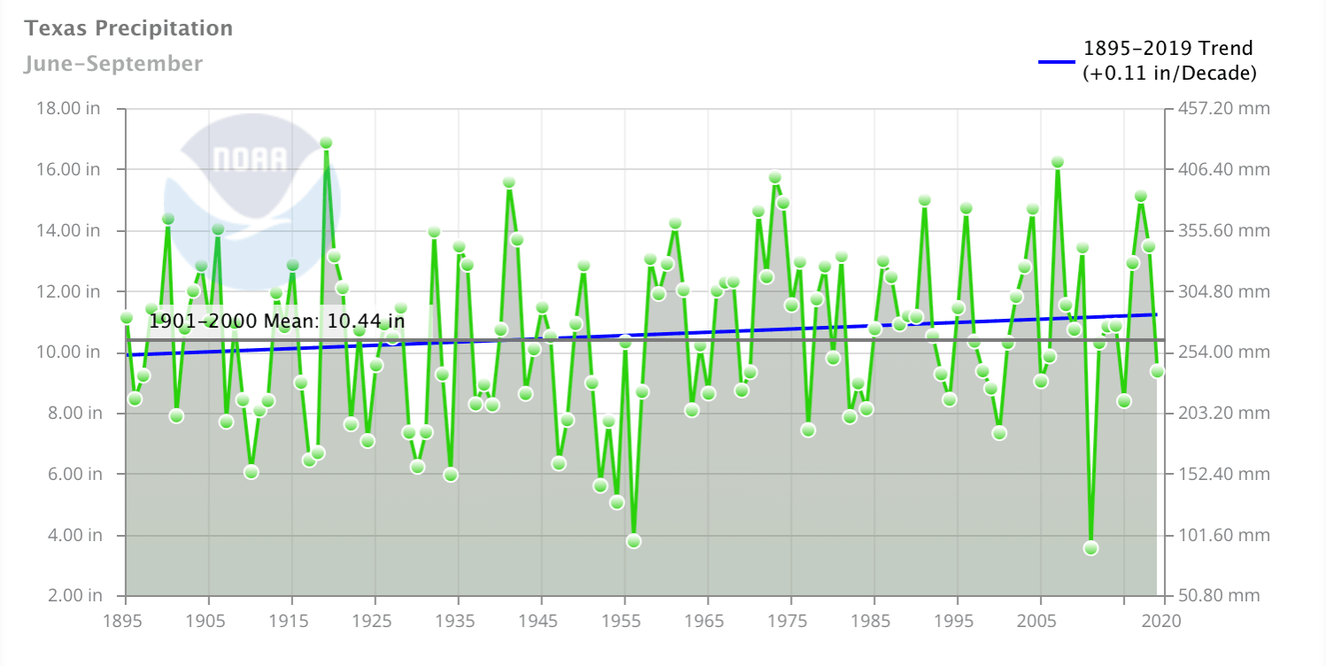
Figure 2. This figure shows the average precipitation per year for the 4-month period before migratory monarchs reach Texas in October. Note the striking difference in the precipitation amounts before and after 1956. The amplitude of the variation appears to be damped with fewer years with low rainfall later in the record. Climate at a Glance.
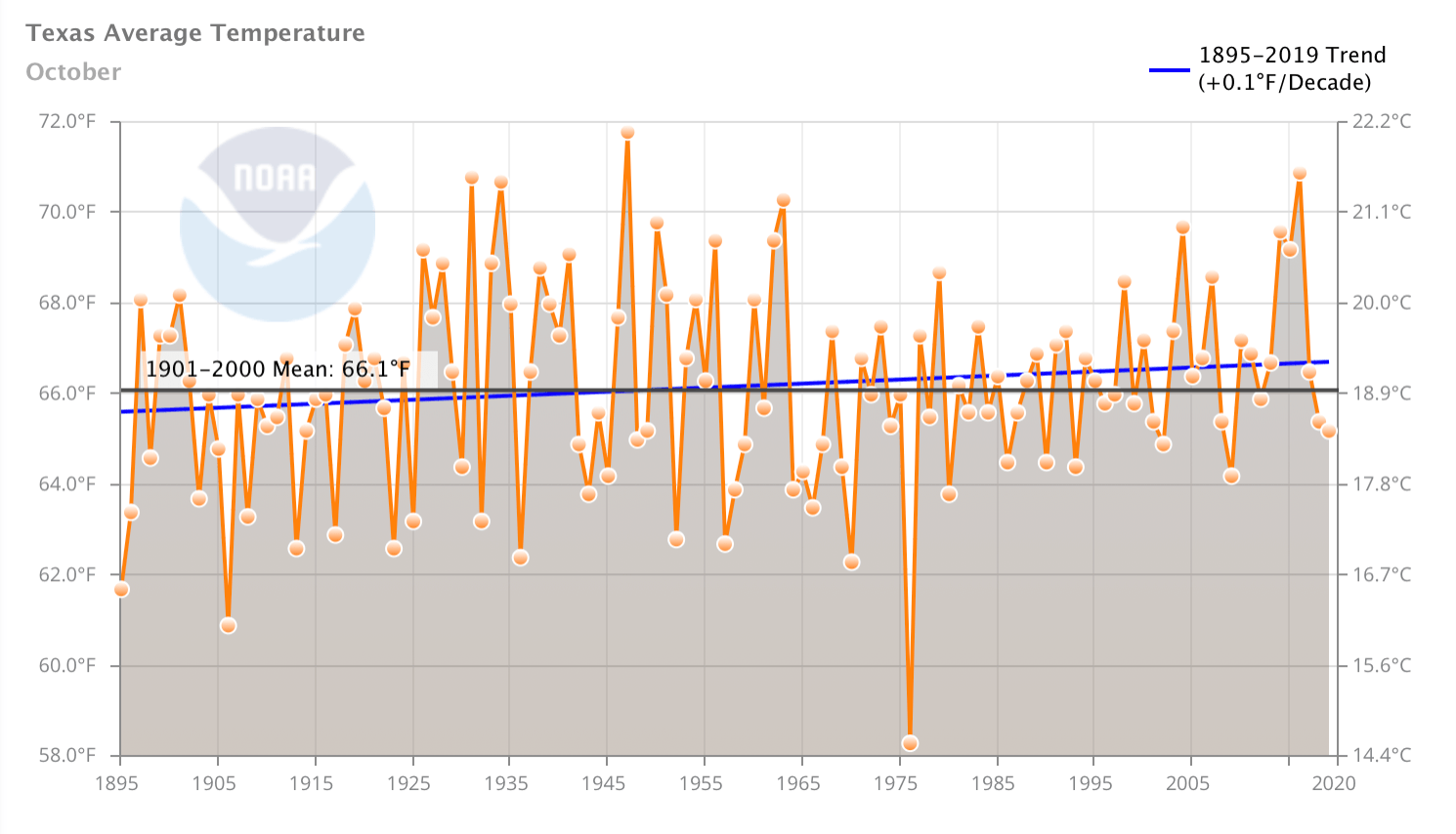
Figure 3. This figure summarizes average temperatures for October for Texas from 1895-2019. Note the substantial year to year variation in the period before 1976 and the distinct damping of both the low and high ranges from that year onward. Patterns of damping of weather features are common in most temperature records for both March and October indicating that monarchs are experiencing less variability over the last 30 years than in the past. Climate at a Glance.
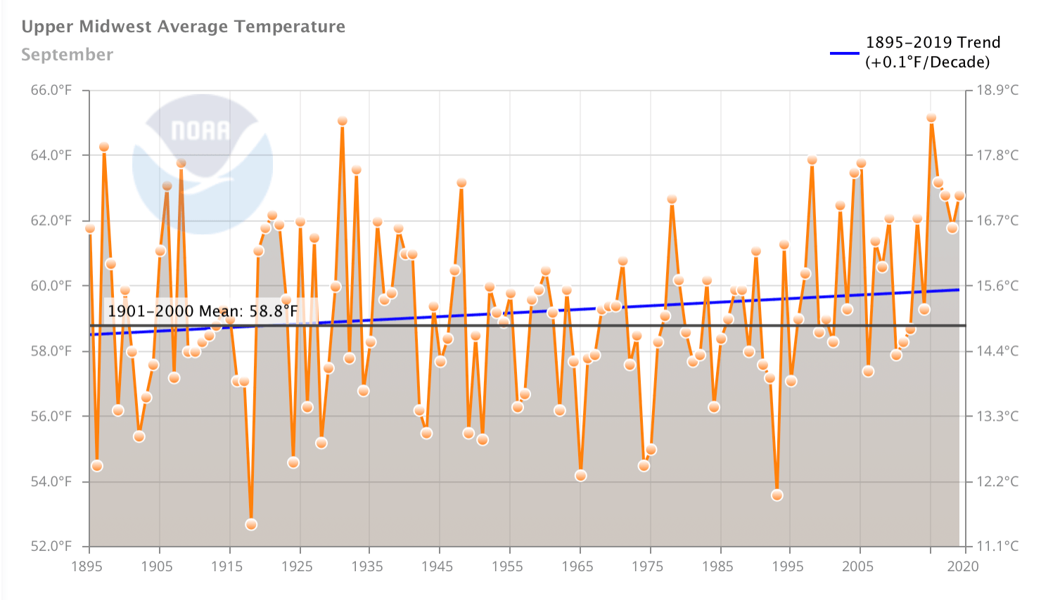
Figure 4. This figure represents the average temperatures experienced by monarchs as they migrate through the Midwest in September (1895-2019). Again, note the range of these averages in the early years of this record and the appearance of a reduction of this variation in recent decades. The starting point for these shifts is generally associated with the mid 70s coincident with observations by many biologists of seasonal changes seen in animals and plants (phenology). Climate at a Glance.


Sorry, comments for this entry are closed at this time.