Climate Report 2008
Wednesday, April 29th, 2009 at 9:29 am by Chip TaylorFiled under General, Phenology | Comments Off on Climate Report 2008
If I’m paying attention, I can find information about the environment every day in newspapers or on major websites that cover national and international news. The stories are often disturbing and I tend to make a mental note of the general themes and move on. There is too much bad news to absorb. Sometimes all these stories get pushed aside due to politics, conflicts, and disasters. This may be what happened with the report of the earth’s surface temperature for 2008 that came out recently:
I haven’t seen this report cited in the papers or on any of the major internet news outlets. The report was authored by the renowned James Hansen and a team of climatologists. If you don’t have the time or patience to read this article, scan the figures as they tell the story of climates past and show where we are at present. If you are a teacher of middle school or high school students, this report will give your students some of the background they need to understand the issues associated with climate change, a topic that all of us as concerned citizens should be aware of. The general increase in the surface temperatures of the world are shown in the figures. As predicted from all the models, Figure 1 (Right) shows that the temperate and arctic regions are heating up faster than the rest of the planet.

Figure 1. Left: Annual-mean global-mean anomalies. Right: Global map of surface temperature anomalies for 2008.
Note also the hot spot that represents California on this figure. High temperatures in California over the last 15 years are certainly one of the factors associated with the decline of western monarch populations but that is another story:
In Figure 2 you can see that global surface temperatures began to increase significantly in the 70s and they continue to rise. In spite of being a bit cooler in 2008 than in recent years, 2008 was still the eighth warmest year on record. But, there are other curious patterns in the climate data. I’ve spent many hours trying to relate monarch numbers to climate variability and one of the things that jumped out at me in the climate data was the dramatic shift in the pattern of year-to-year variation that began in the mid 70s.

Figure 2. Seasonal-mean global and low latitude temperature anomalies relative to 1951-1980 base period.
You can verify this shift by visiting Climate at a Glance, and plugging in the data for winter months from 1895 to the present for your state or region of the country. Below is the record for Kansas for the month of March. Note how the amplitude of the variation of year-to-year temperatures has been reduced since the mid 70s. March temperatures used to be both colder and hotter than they have been in the last 30 years – on average – and the general trend is for warmer early spring temperatures. These warmer springs are one of the reasons for the phenology project.
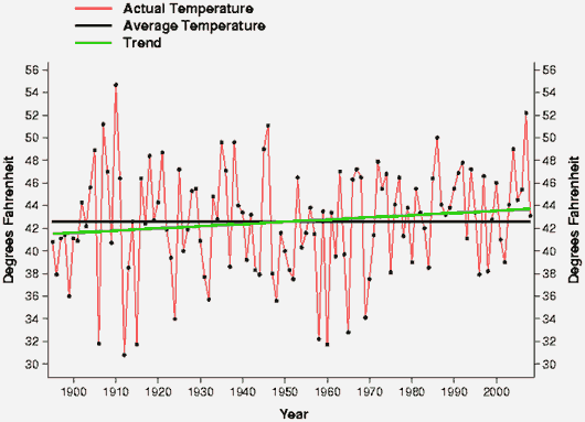
March 1901 – 2000 Average = 42.59 degF
March 1895 – 2008 Trend = 0.19 degF / Decade
And then there is the October record for Kansas (check out your state). Again, we see that the amplitude of the average monthly temperatures for October show less variation from the mid-seventies to the present than at any previous time in this record.
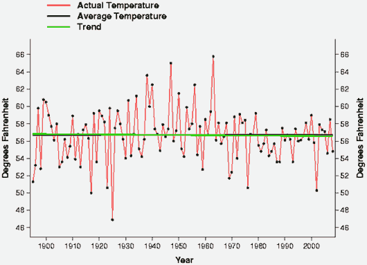
October 1901 – 2000 Average = 56.72 degF
October 1895 – 2008 Trend = -0.02 degF / Decade
What does this mean? In general, it means that the last frosts in the spring will be earlier and the first frosts in the fall are later than in the past, giving rise to longer growing seasons. But, why is the warm period of the year getting longer and longer? There must be something larger at work here. What is damping the variation in the average temperatures of these months that provide the transitions from one season to another? I’ve shown these trends to a meteorologist and several ecologists and no one has been able to provide a good cause and effect explanation for these trends.
Unfortunately, there are no indications that the warming trend indicated by all of these data is going to slow down or decrease. Greenhouse gases that trap outgoing radiation are increasing. Indeed, given the rate of increase in the number of part per million of carbon dioxide in the atmosphere in recent years (average increase in ppm per year for the last 5 decades starting in 1959 = .91, 1.23, 1.63, 1.53, 1.97 – from NOAA Research), it is likely that the global surface temperatures will rise even more rapidly in the coming decades. The prospective consequences of such changes are much debated but it is certain that emissions must be reduced or the world will be a very different and less hospitable place in the future.


Sorry, comments for this entry are closed at this time.